
As a frequent flyer, I encounter the Delta website often. I wondered if there may be ways improve the website's user experience or to increase profitability for the company. While conducting an internal audit revealed no obvious usability violations, user research revealed that not many folks knew about "Delta Vacations". I wondered why this newer feature may be underrepresented, and, how might we be able to increase visibility in order to drive profits for the business?
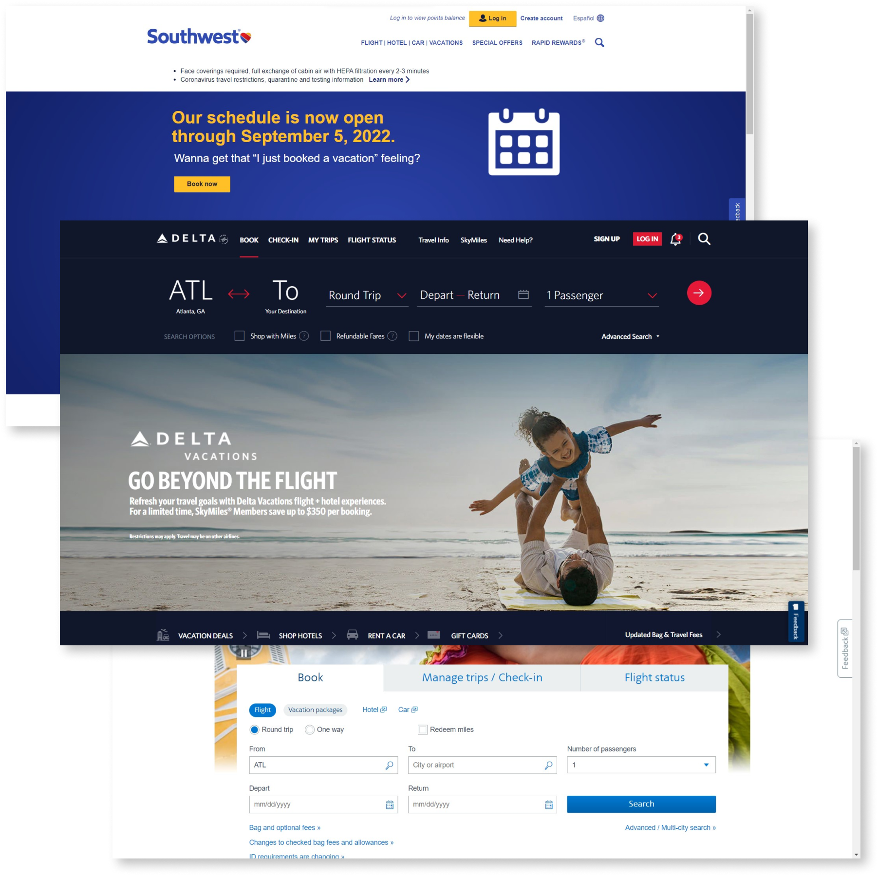
I completed both a Heuristic Evaluation of Delta.com and Competitive Feature Analysis (Delta, American Airlines, and Southwest Airlines) to learn more about the website and its place in the market before going to speak with actual users. I used Nielsen's 10 usability heuristics and could not find any moderate or major usability violations. Additionally, I identified critical usability features like search filtering and packaged offerings to compare Delta against its major competitors; Delta leads the pack. They've got it all, and more comparatively.
With no obvious missteps to correct, I would now need to speak with users to see how they felt about Delta's website.
I wanted to learn more about which features were most important to the user, understand the user's motivations for using the website, and how users thought and experienced what they perceived as difficulties within the site.
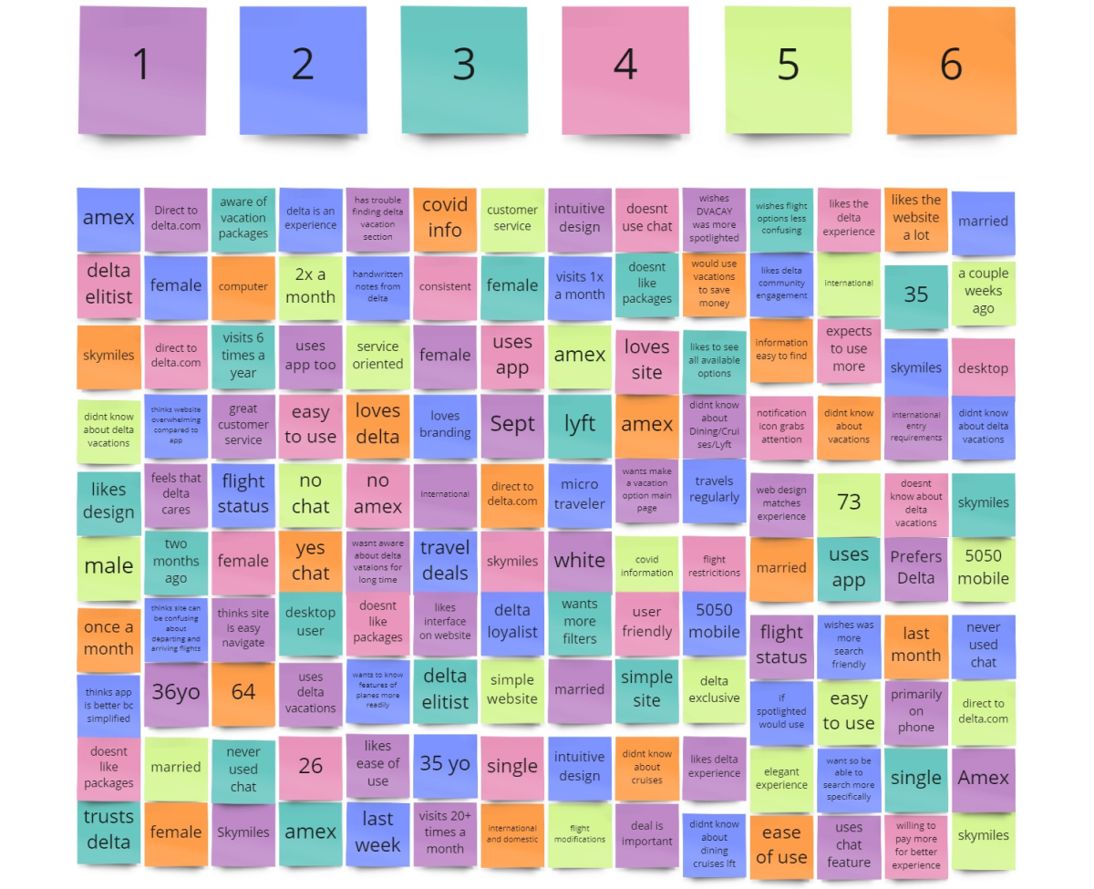
I targeted people who frequently flew the airline and also used the site at least one time in the last six months. I spoke with six people at the Atlanta airport who were at Delta gates. Below are questions that revealed helpful insights:
The user Interviews highlighted brand loyalty to Delta but also spotlighted unused site features which may be used to increase business profitability. Ultimately, one of the most valuable follow up questions that I asked revolved around the use of Delta Vacations, a service that bundles flight/car/hotel for users directly on the Delta.com website. Not many users knew about this feature even though it could be an asset for frequent Delta travelers.
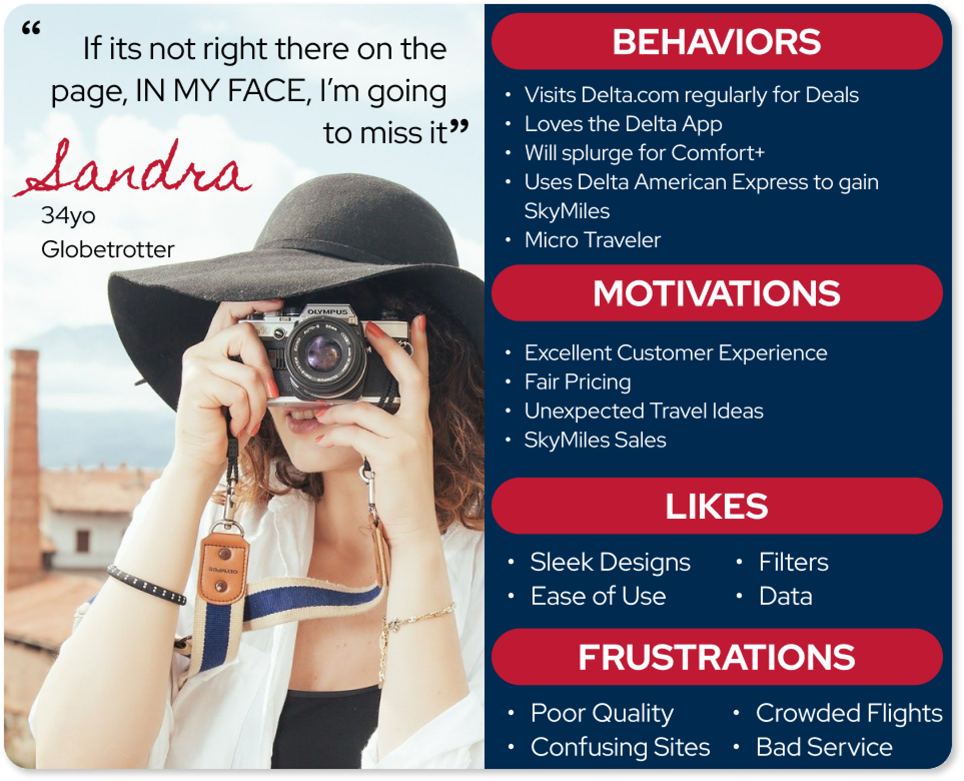
I developed a persona, Sandra, to help define a problem space and swiftly begin thinking of ways that may help Sandra learn more about Delta Vacations and help Delta make more money through Delta Vacations.
I created a scenario and task to see how users are currently navigating the website in an attempt to complete the task. The task asked users to book a bundled vacation for themselves and their family to Paris in March. They likely needed flights, a car, and a hotel.
While sitting in the airport waiting for my flight, I conducted user testing with 10 real life Delta customers who have, at some point in their lives, traveled to Europe for at least one week. I timed how long it took them to get complete the task. On average, it took 53.2 seconds before users even found the page to begin completing the task!
During this stage of testing, I was able to hear more frustrations with the site; irritations with information sorting, annoyance of lack of promotion/highlighting for Delta Vacations and others. In fact, of the 10 users tested in the airport, none were aware of the Delta Vacations Program and all 10 were interested in learning more information.
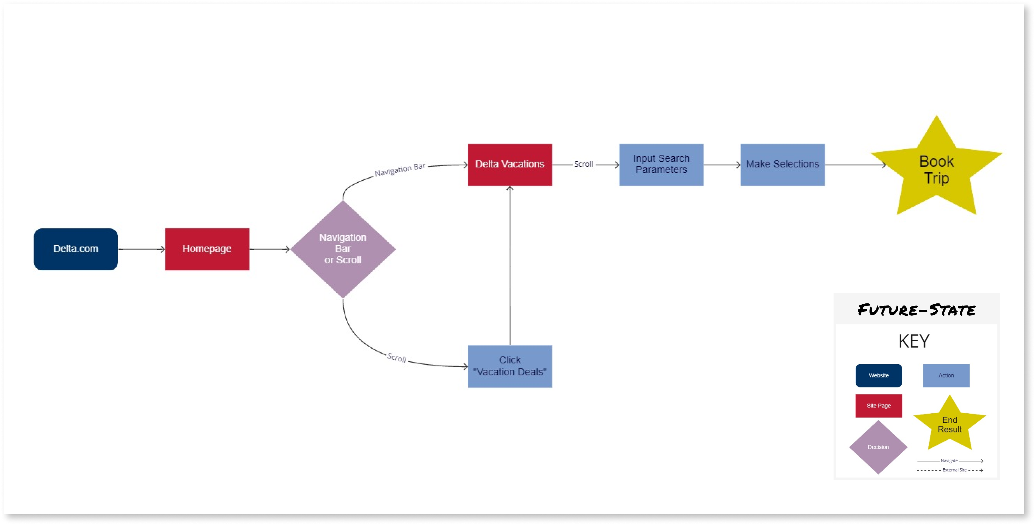
To document what I found from usability testing I created a user flow diagram which shows the current through the Delta website to use Delta Vacations. In the flow, Sandra is completing the task that the real life users were given: book a bundled trip for her and her family to Paris for two weeks in March. She needs flights, hotels, and a car. Like them, she wants an easy experience and a good deal.
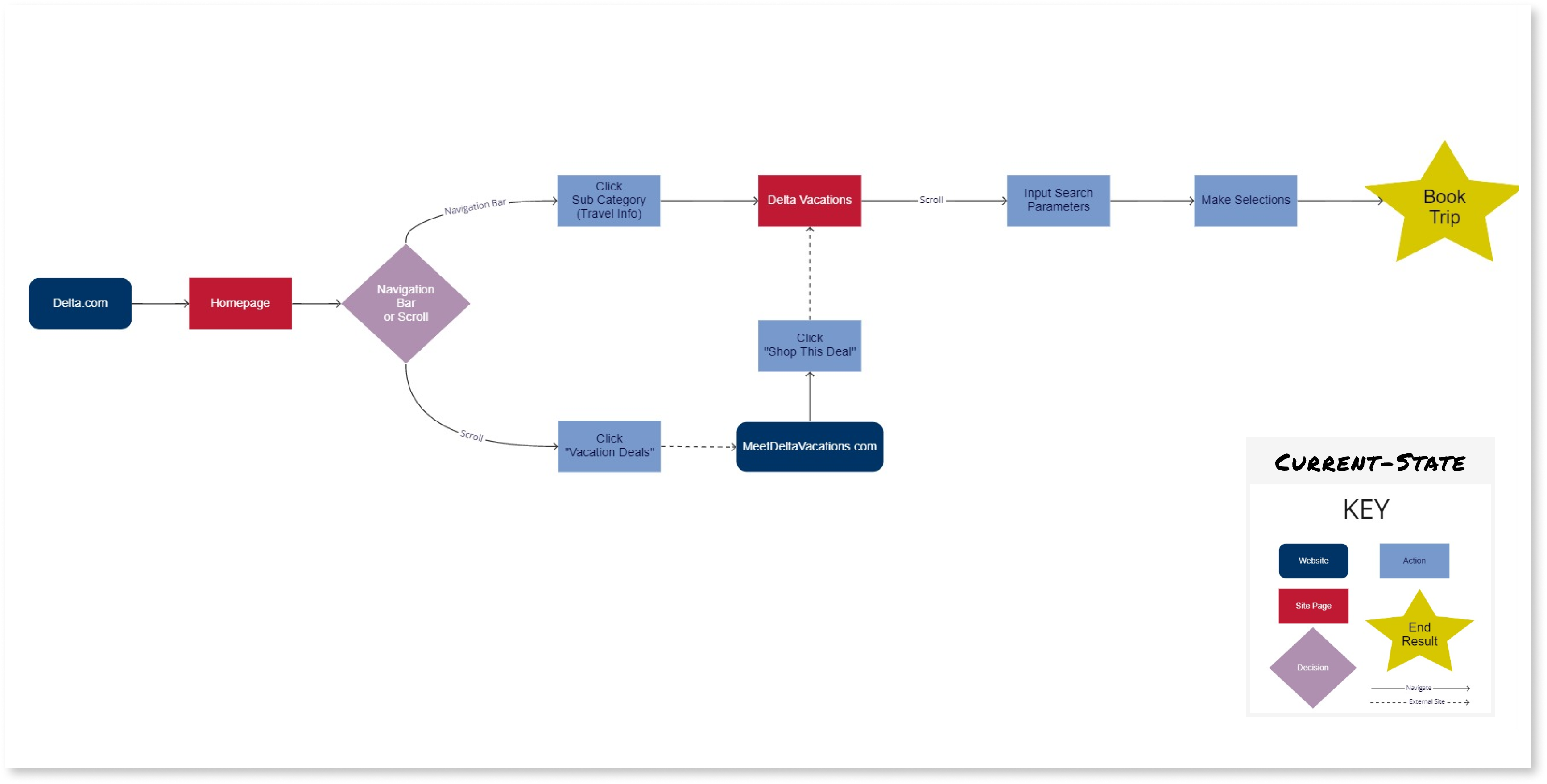
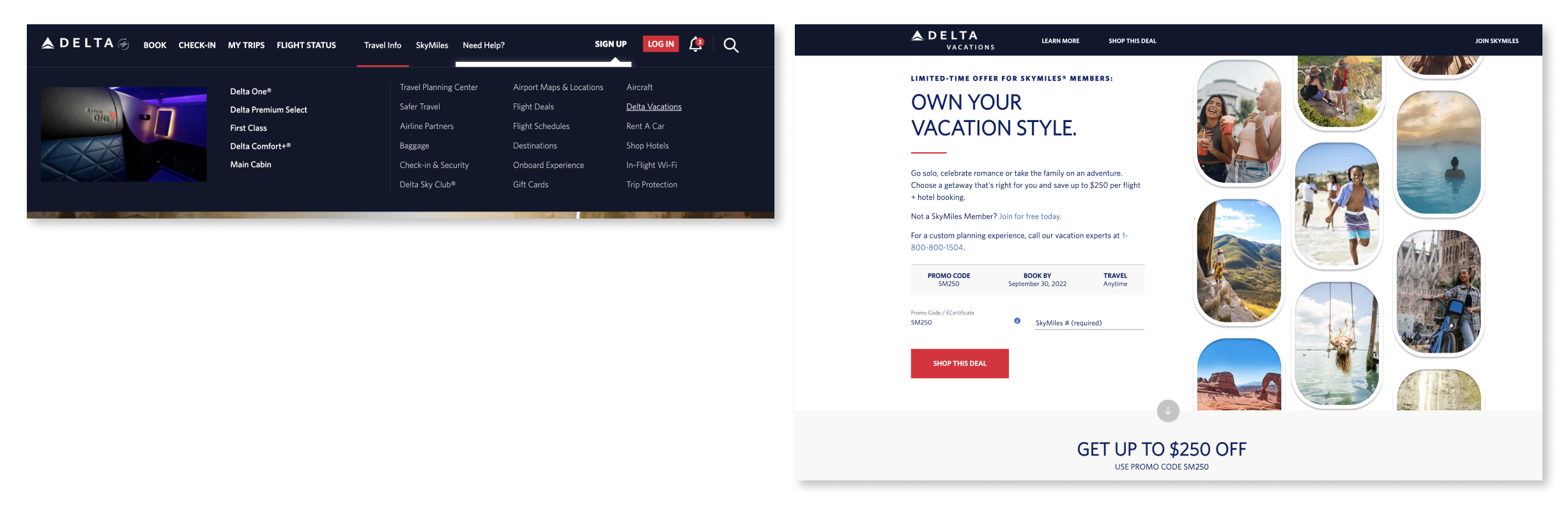
The current flow requires users navigate to a subcategory (Travel Info) of the Navigation Bar before discovering the Delta Vacations link which has been buried in the third column. Users were also able to navigate by scrolling and clicking a button labeled “Vacation Deals” which took them to an external site only to link them back to the Delta Vacations page (hosted on Delta.com) to complete the task. This proves problematic as this process slows everything down - page load speed, booking, etc.
At this point it was abundantly clear. Why is Delta Vacations not showcased on the website? How might I be able to ease user frustrations navigating to this service and increase Delta revenue at the same time?
Armed with this information, I was able to create a proposed New User Flow which would quickly lead consumers to the Delta Vacations page. I examined my research and findings and came to the conclusion that Delta Vacations needed it's own section in the top navigation bar. I immediately created mock-ups and completed another round of user testing which confirmed that my proposed changes alleviated the frustrations of finding the Delta Vacations page.
I added a new tab/button for “Delta Vacations” to the navigation bar on the desktop website. With center placement and Delta Red text, this will immediately grab the attention of users that otherwise wouldn't know this service exists. Furthermore, this will reduce the amount of clicks required to access the service.
I used this prototype and conducted 10 more in-person user tests with new users with the same task. The amount of time spent getting to the Delta Vacations page dropped to a 10.4 second average - that's 5X faster!
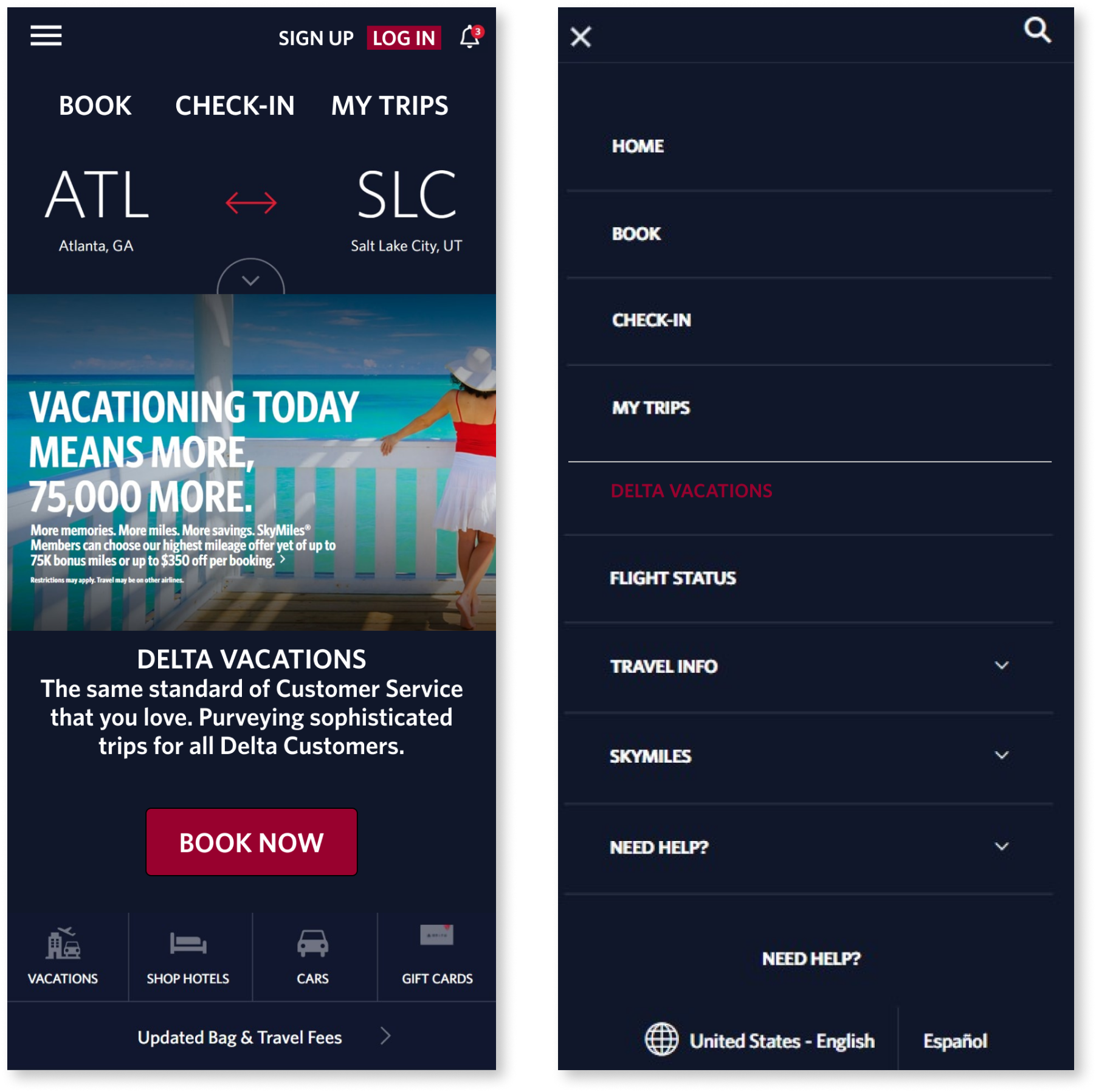
While prototype testing confirmed that my modifications were effective, it also provided me with stylistic and aesthetic suggestions on how to improve the design. These suggestions were considered and several were implemented in the final deliverables which included mobile mockups. Now, in mobile view, Delta Vacations (again in Delta Red) is given its own tab in the hamburger menu.
I prepared a presentation to help share my process with others. With my solution, Delta.com users are more readily exposed to Delta Vacations and can utilize the service in fewer clicks. Ultimately, I worked diligently to uncover an under-tapped revenue source for a multi-billion dollar well-oiled machine.
One of the most important things I learned was how to produce working prototypes using both mobile and web platforms; with so many people relying on their cell phones, website solutions should be optimized for mobile-first. In the future, I would be sure to check with users to learn which devices users prefer.
I also learned the importance of quickly changing strategy; Heuristic Evaluations and Competitive Feature Analysis uncovered virtually no problem areas. Also, because of the well designed current state of the site, tree testing was unable to showcase the problem empirically. It was quickly clear that conducting user testing was the most effective method of quantifying the problem.