We assessed the current-state of the Hollerbach's Restaurant website to discover that all four businesses are represented on this one website. Unfortunately, the established navigation and labeling of content does not create an easy-to-use experience. We worked to conduct research to identify the most problematic areas; then, we proposed solutions that would improve the user's experience.
Hollerbach's is a small business in the suburbs of Orlando, Florida. They have four separate establishments within walking distance of one another: a restaurant, catering, a deli, and a clothing shop. The business wants to have all of these businesses featured on one website, but as it is right now, it appears cluttered and confusing.
We were provided with both the primary persona and the customer journey map for the work. While there are many types of users that will visit the Hollerbach's website, Michael represents the primary type of visitor that the business wants to attract.
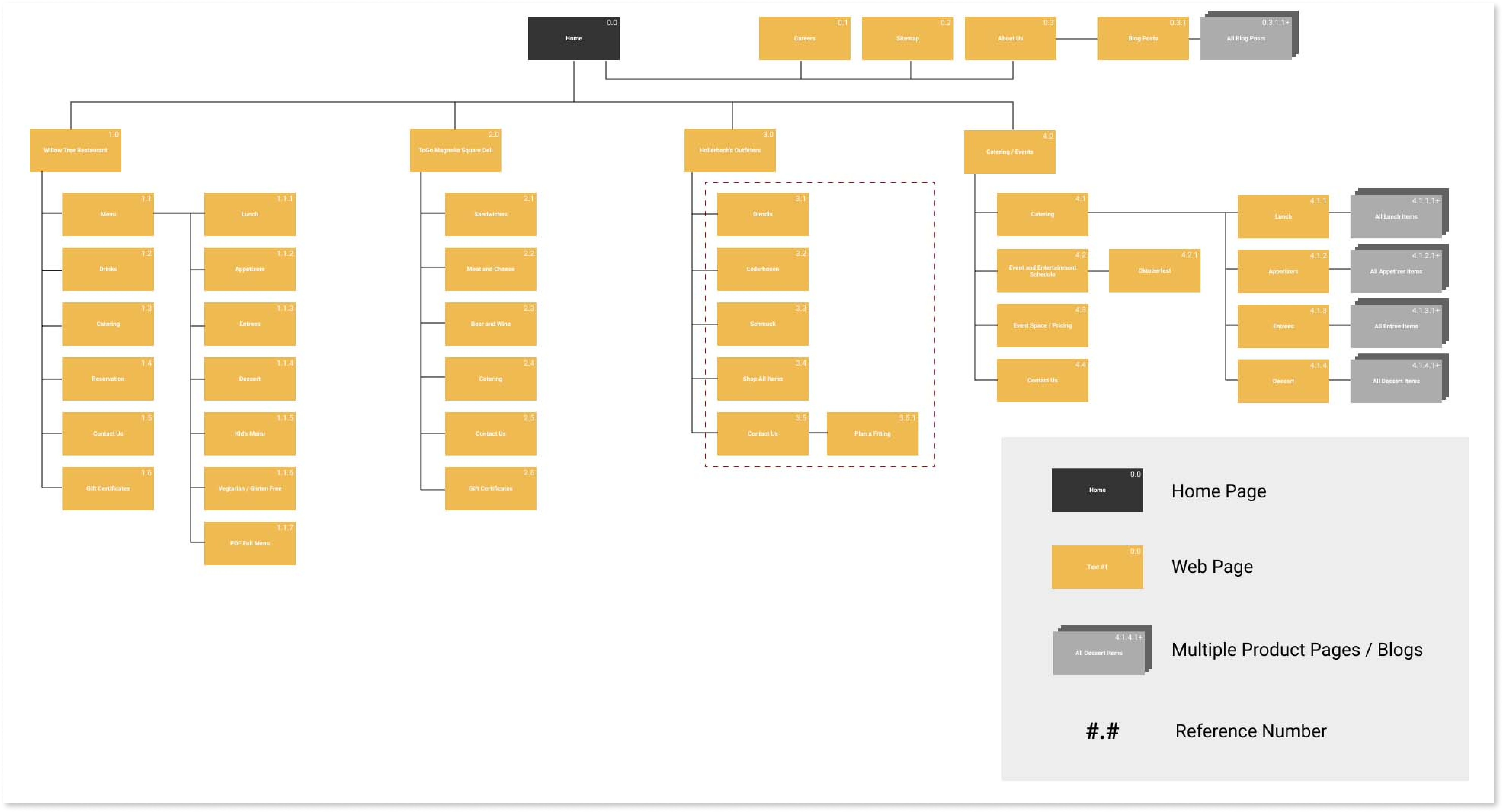
After exploring provided documents, we began cataloguing the entire website including hidden pages (found via SERP). Then, we constructed a complete, current-state sitemap which included reference numbers for future wireframing and mockups.
This activity revealed an overwhelmingly chaotic infrastructure; the site was overwhelming and poorly organized. Additionally, we discovered dozens of pages that should be archived or converted to blog posts. Furthermore, we were able to identify categories of content that we would want to test with users.
After visualizing the categorical problems through sitemapping, we completed a thorough and comprehensive inventory of all content on the site. By doing this we were able to recognize established, important topics - as well as catalog available information. Through this process we were able to discover a wealth of data while locating discrepancies. We uncovered topics that would be used in both open and closed card sorting.
Based on initial investigation of the site it was abundantly clear that it needed direction. With a plethora of content, users would need clear pathways to find information quickly. Below are more of our gut reactions and ideas. Some we pursued, and others would have to wait until later projects. Perhaps one of the more significant hypotheses was that users would positively respond to choosing which business to patron right from the beginning - there was definitely a lot to be learned through research.
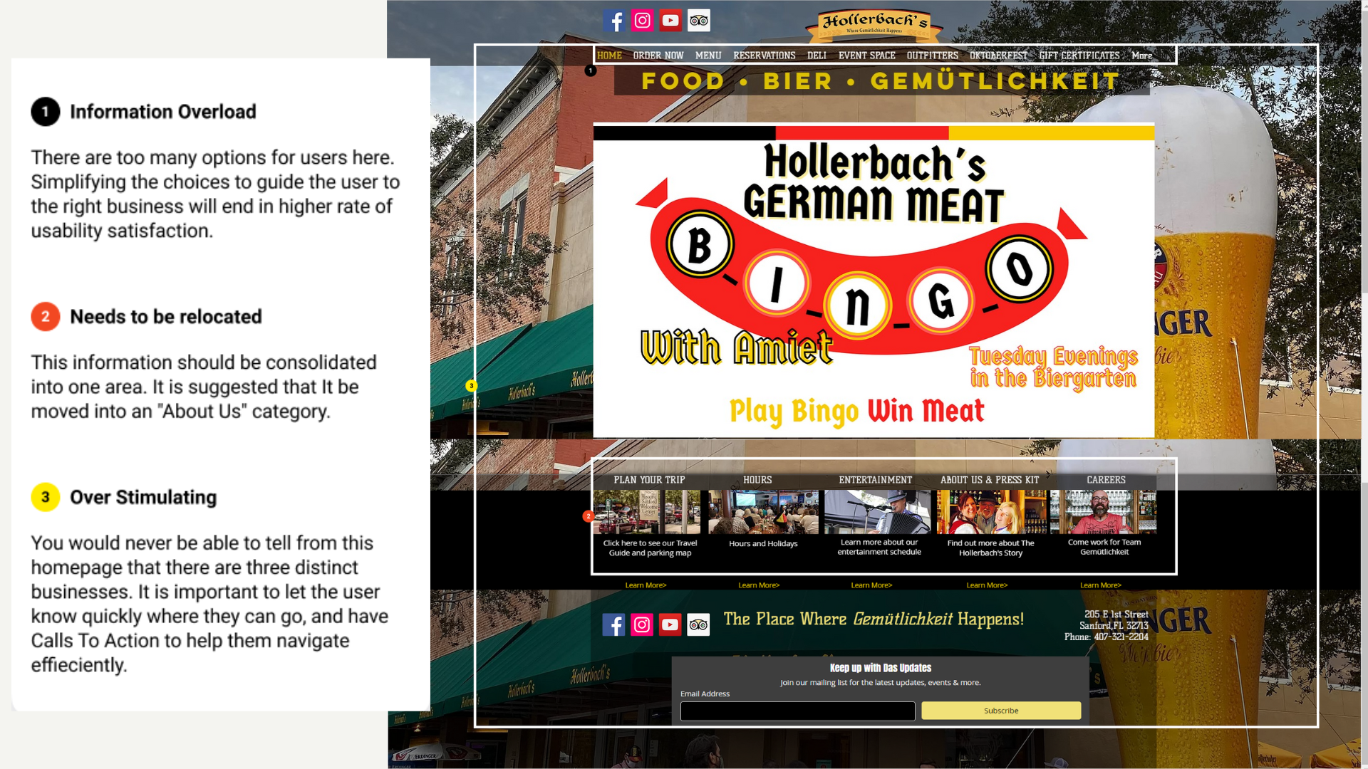
It was time to figure things out. Through UXtweak, we pulled 20 topics from the sitemap and content inventory and had 10 users complete a digital, unmoderated open card sort. This activity confirmed our theory that the website was not clear to the user. It seemed like food categories were the only consistently grouped cards. Perhaps some of the other labels were too vague to be grouped consistently. More research was needed.
* In an ideal situation, we would expand the number of cards sorted and the number of participants tested.
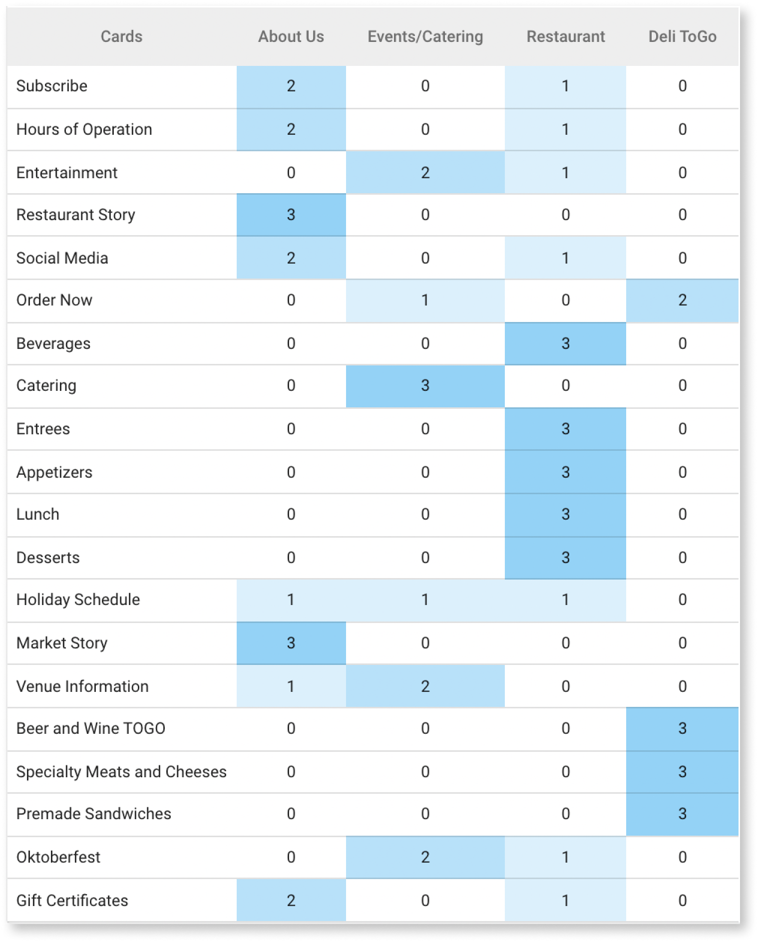
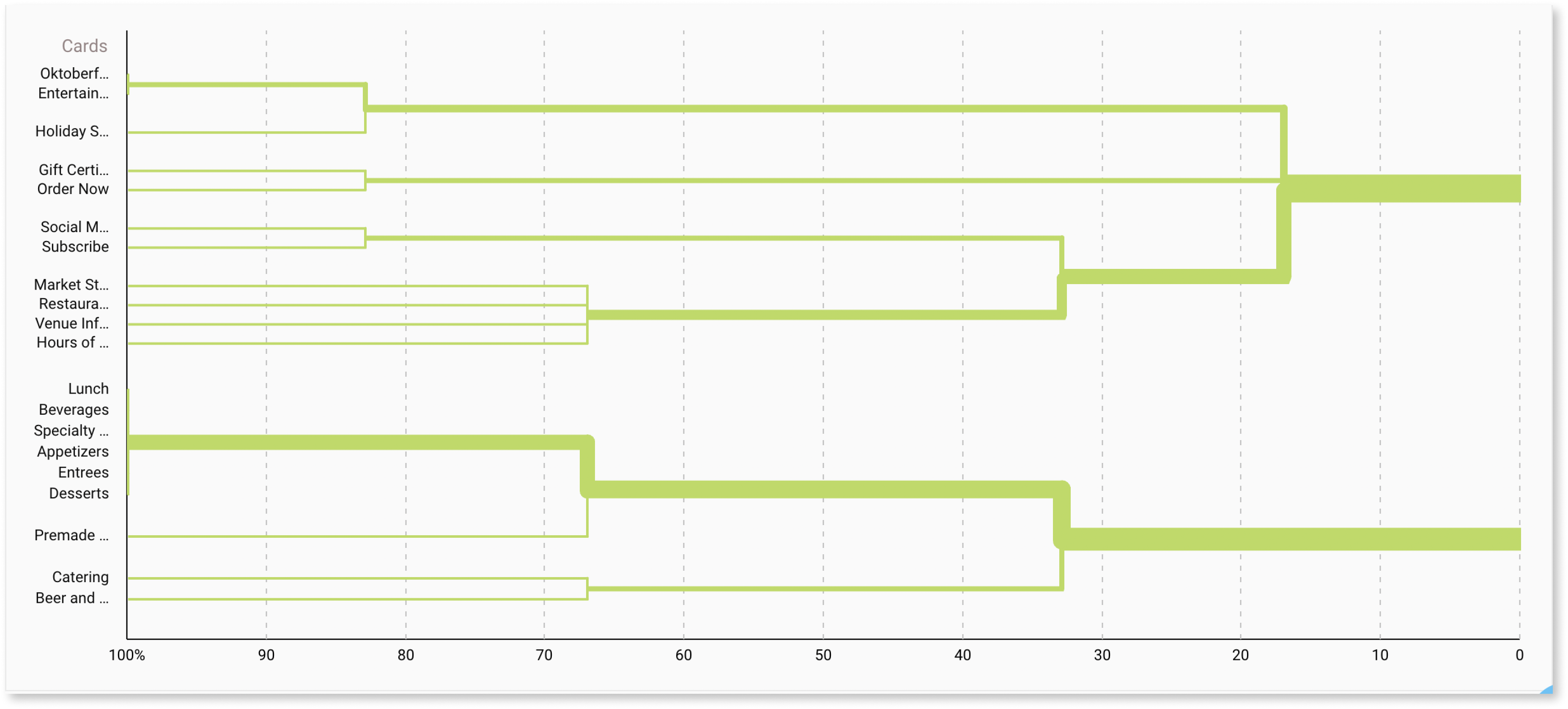
To continue investigating, we conducted a closed card sort by now providing a couple categories for users to sort cards into. With three users, we used an unmoderated sort through UXtweak.
We could see further agreement as the users grouped food cards together. We could also see a grouping of cards for the Deli emerge. However, there were several cards that could not be consistently placed.
* Again, in an ideal situation, we would expand the number of cards sorted and the number of participants tested.
Currently, one of the four businesses has several pages on a separate domain, but that has become difficult for the business to manage. They want to bring that information back to their main domain. We agree that this could simplify their processes, but the website navigation would need to be restructured. This new sitemap suggests asking users to decide which of the four business entities they are looking to patron from the first click. By encouraging users to decide upfront, we hypothesized that users would be able to complete business specific task with a substantially greater ease. We also recommend utilizing a blog functionality for their dated posts and events. Not only will this help improve their SEO, but it would also be easy for the business to manage.
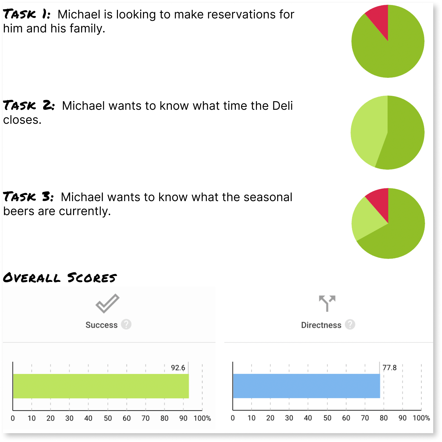
We utilized UXTweak to conduct Tree Testing with the revised sitemap. After nine users completed the tasks, we saw an overall success of 92.6%! This confirmed the hypothesis that a more directly organized sitemap should lead to a better, more efficient user experience.
While users were very successful at ultimately finding what they were looking for, there were some issues with directness that could be further addressed with additional testing in future iterations. How can we make it even easier for users to find what they're after?
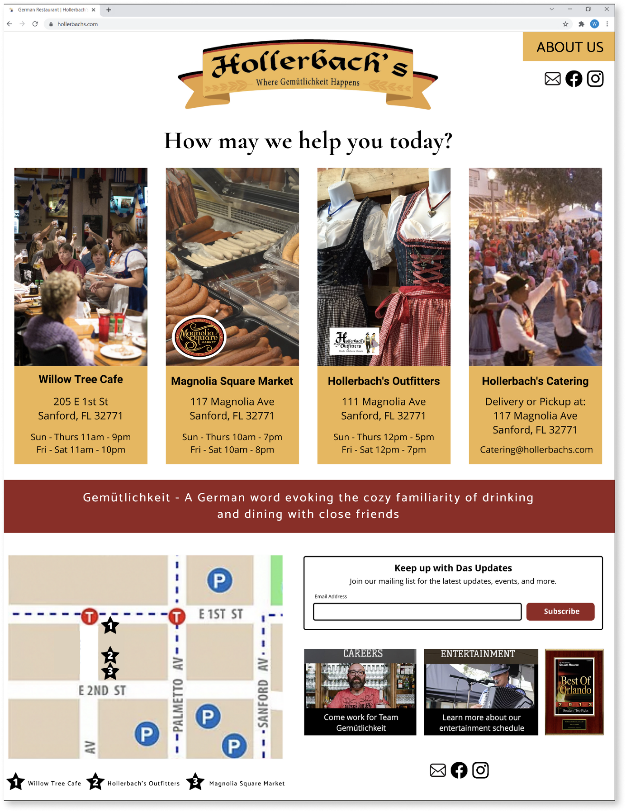
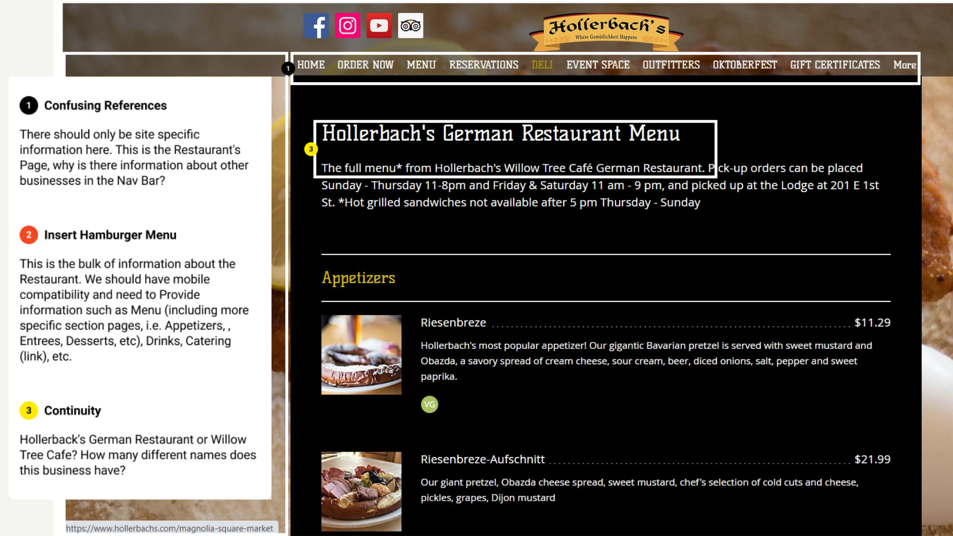
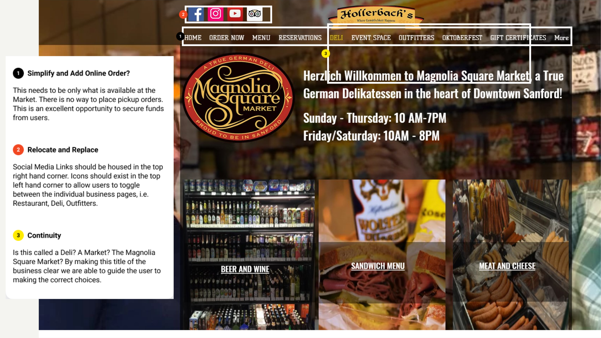
To start, we believe that the homepage should be simplified. Let's clearly separate the four businesses so users can find out what Hollerbach's offers and what a user can do at each business; and, each business should showcase their hours, contact information, and social media. We'd also like to see continuity of business names across the website. For example, is the restaurant called "Hollerbach's German Restaurant" or "Willow Tree Cafe"?
As a bonus, for our family-focused primary user, Michael, we'd love to see the kid's menu in an easier to find location - like on the restaurant menu page. We'd also want to feature a singular map highlighting how close all locations are to one another; this will help to create the Hollerbach's experience.
During this project, I began to understand the importance of site infrastructure. It does not matter how much content you have on the site when users are unable to located and use said information. The website in question was a perfect example of a business that was in need of help; working on this project allowed me to see first hand how important purposeful and clear design truly is in regards to the user's experience. Finally, this was my first UX project with a partner and I was able to cement the value in the concept of divide and conquer.