This purpose of this project was to discover ways to improve the user's experience Spotify mobile application. Our team of three took on specific tasks and responsibilities - all aimed toward exploring the current-state of the app. After discovering some minor problem areas, we were able to visually represent projected solutions through the forms of low, mid, and high fidelity wireframing and ultimately a presentation-ready mockup.
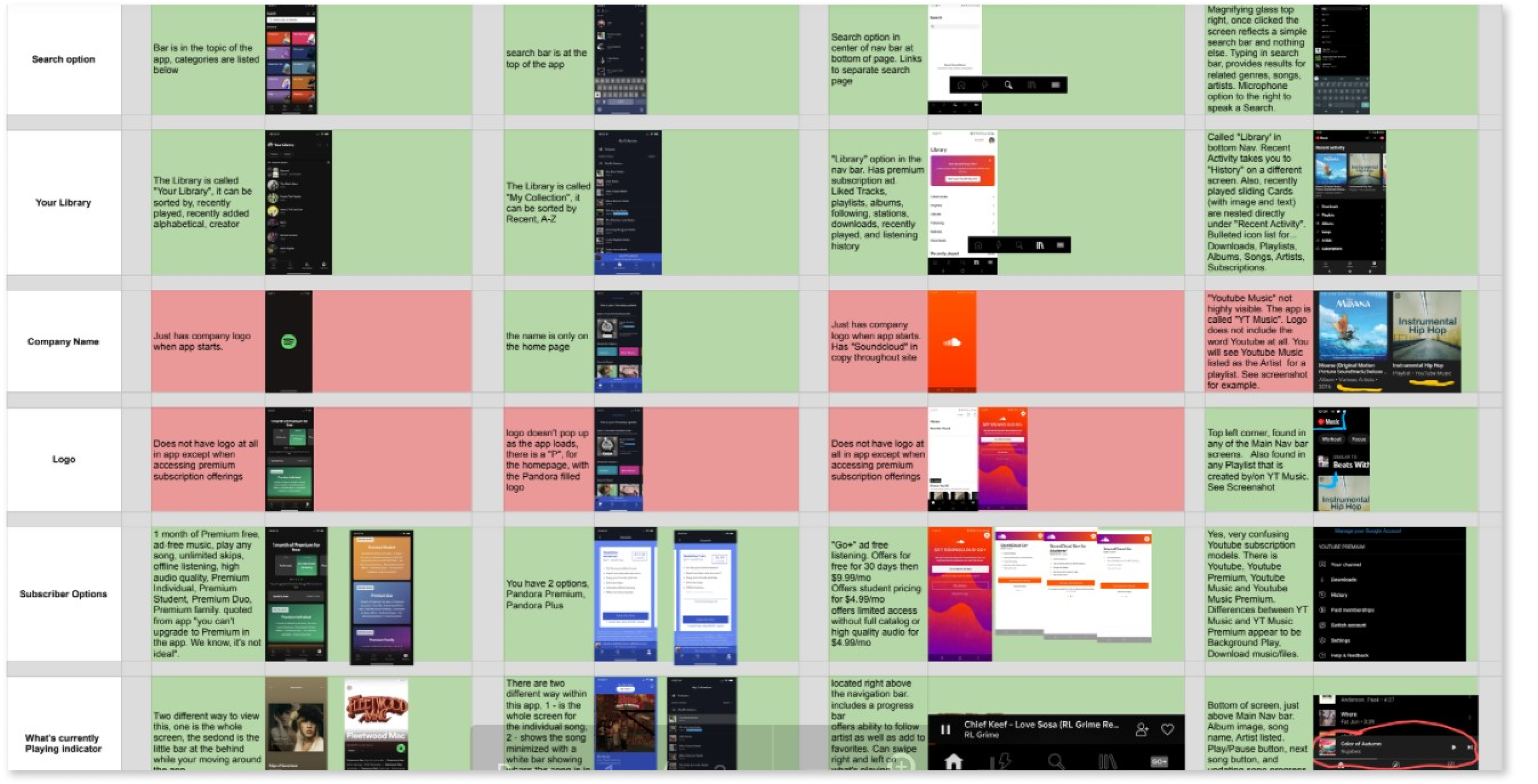
We conducted a heuristic evaluation and competitive feature analysis to assess the current-state usability of the application. We gathered a baseline understanding of the Spotify application and it's place in the market before speaking with actual users.
We discerned that the application was adequate for the average user and didn't have many usability issues. However, we noticed that there could be some improvements with ease of use options, specifically issues with the Match between System and Real World, Recognition vs Recall, and Help and Documentation. There were issues with word choice which confused users as well as application organization that did not lead to a flexible, easy to use experience.
It was time to determine if what we had found impacted real users. We specifically target veteran Spotify Users with 5+ years of daily use. In an effort to potentially uncover more untapped problem areas, we kept our research broad and let users describe in detail their experiences with the app in general. We created a discussion guide with interview questions (including deep dive follow ups) to help navigate the conversations; maintaining a mindful perspective to ensure unbiased questioning and data. Ultimately we interviewed 8 users, 4 males and 4 females ranging in age from 15 to 45. We were able to discuss with them in depth about their interactions with the application including their likes and dislikes.
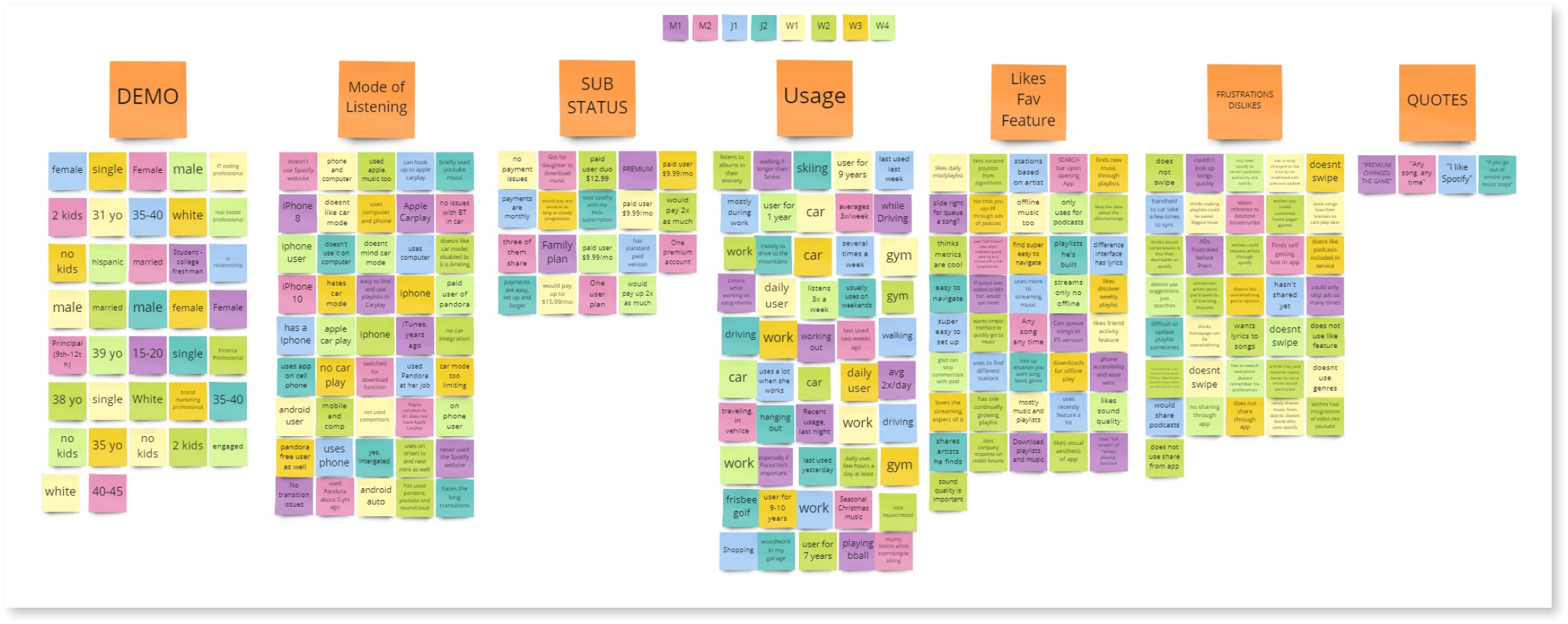
Once completing the interview process, we used affinity mapping to synthesize our collected data. All data points were identified and then grouped with similar points. Once everything had been grouped, clear and identifiable designations were created, thus establishing major insights collected from the interviews.
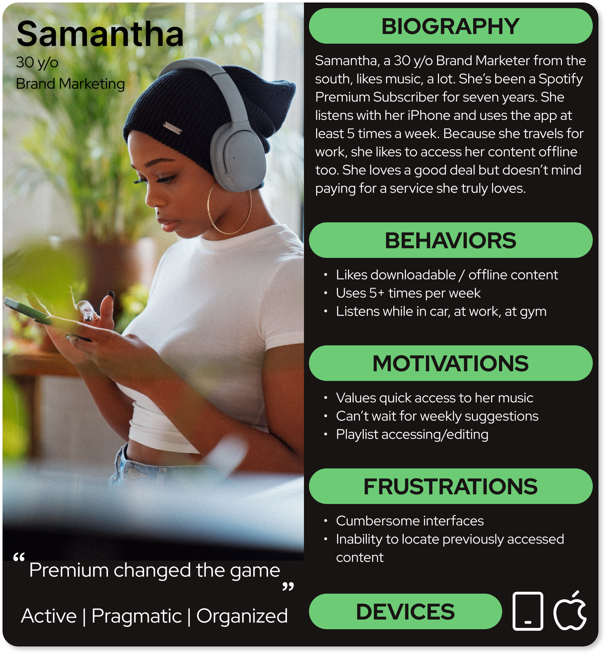
Ultimately we were able to use these collected insights to create a persona representative of our targeted user group; allowing us to more clearly see actual user struggles with an application previously thought more sound.
We created a scenario and two tasks to see how users are currently navigating the app. The first task asked users to locate a specific playlist from a specific subgenre of music featuring a specific artist. Our testing indicated that users immediately went to the search bar, and 0 out of 6 users attempted to find the playlist using the genre section.
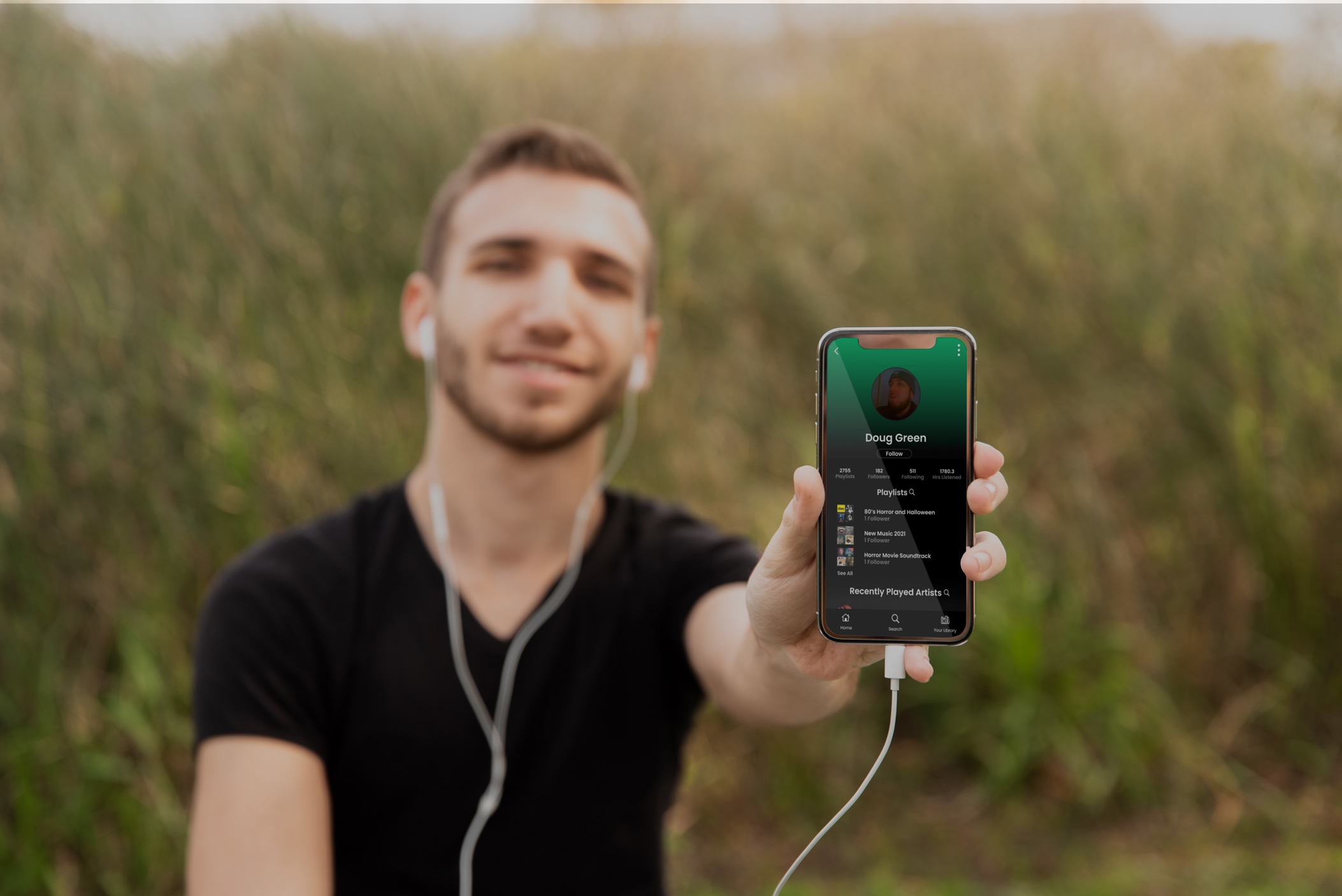
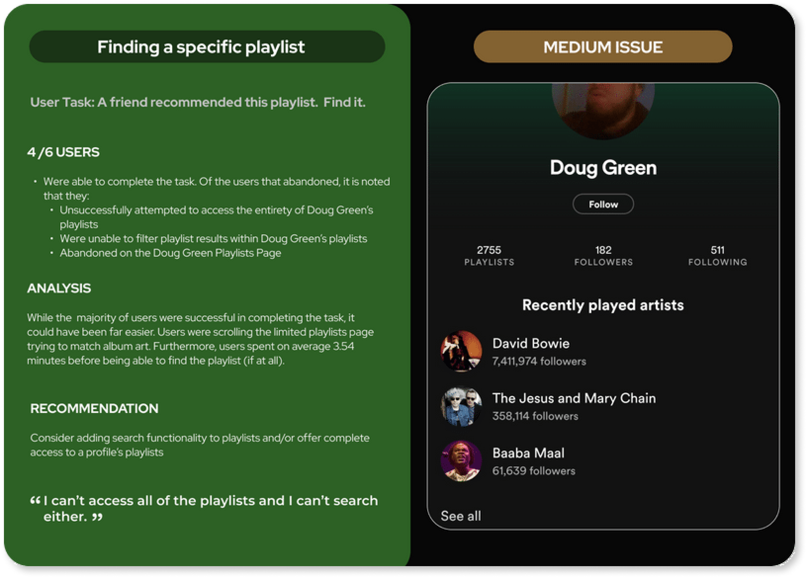
The second task was designed to see how users would find a playlist given only certain information. They were given the playlist cover art, author, and genre tags, but were not given the actual name of the playlist. 5 out of 6 users immediately went to the profile page of the playlist creator. Here's where things got interesting. In its current version, Spotify allows you to browse a profile's playlists, but it limits the number presented and also lacks a search feature. Users spent on average just shy of 4 minutes (3:54) unsuccessfully browsing the provided playlists before realizing they were unable to complete the task in that manner.
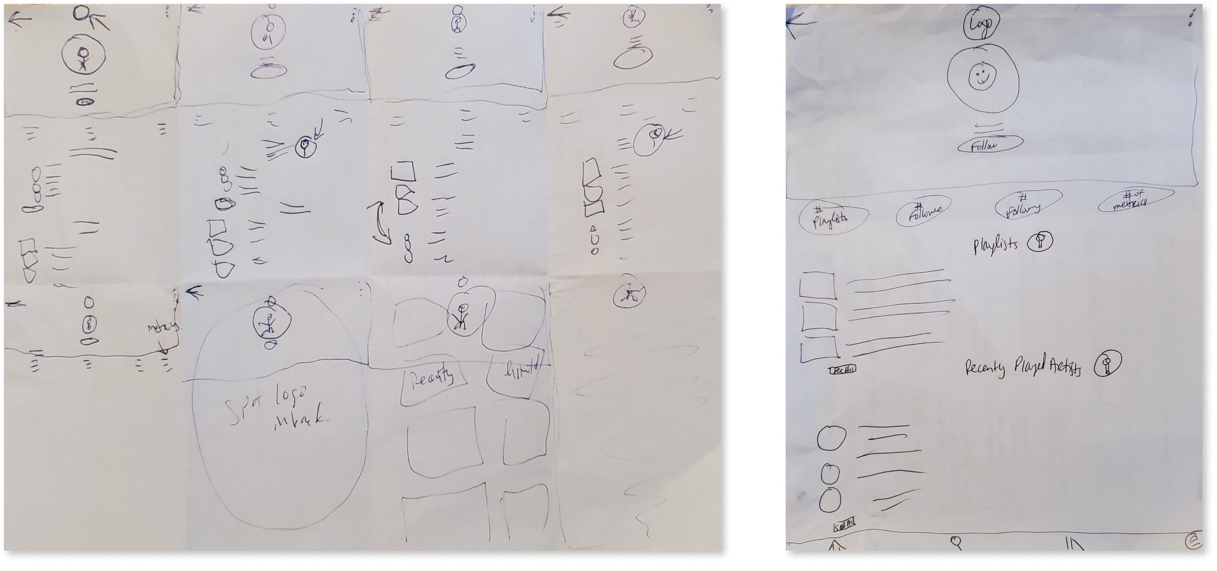
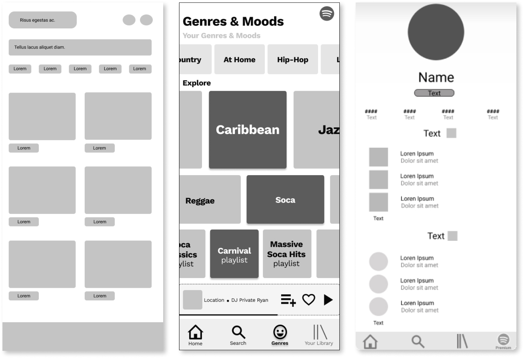
Each team member instinctively honed in on a particular problem identified through user testing. We ideated - using traditional UX strategies like Crazy 8s and hand sketching basic wireframes. We then converted sketches into mid-fidelity digital wireframes to gain feedback from each other before finalizing our individual ideas in high-fidelity wireframes.
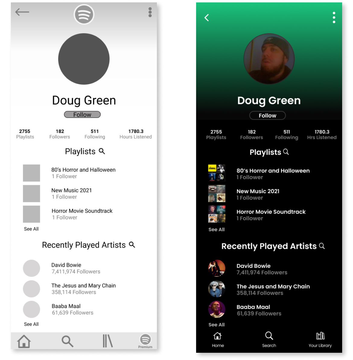
Although we each had individual ideas, we presented overall changes collectively. We agreed that stylistic changes should occur to minimize the design for the genres page. Our research indicated that users felt overwhelmed with the options so we minimized options and added a "see more" option for those interested in exploring through genres. We also made design changes to the profile page and added search capabilities.
We assembled all of our research and findings to help our audience understand the problem at hand, then we shared each of our proposed solutions. The audience critiqued each design and gave each of us valuable feedback that we could all use in the future. Ultimately, they selected one idea as the one that best fit the needs of the user.
While my idea wasn't selected, I fully understood how my teammate's idea enhanced the user's experience AND had the added possibility of increasing the user's experience by making the application easier to navigate and more customizable.
One of the most important things to remember when working with a group is that your idea isn't always the best. I presented the work that felt would make the greatest impact to the application, and ultimately, the stakeholders felt that other ideas were more applicable.